Acknowlogy

Keeping Workers Safe

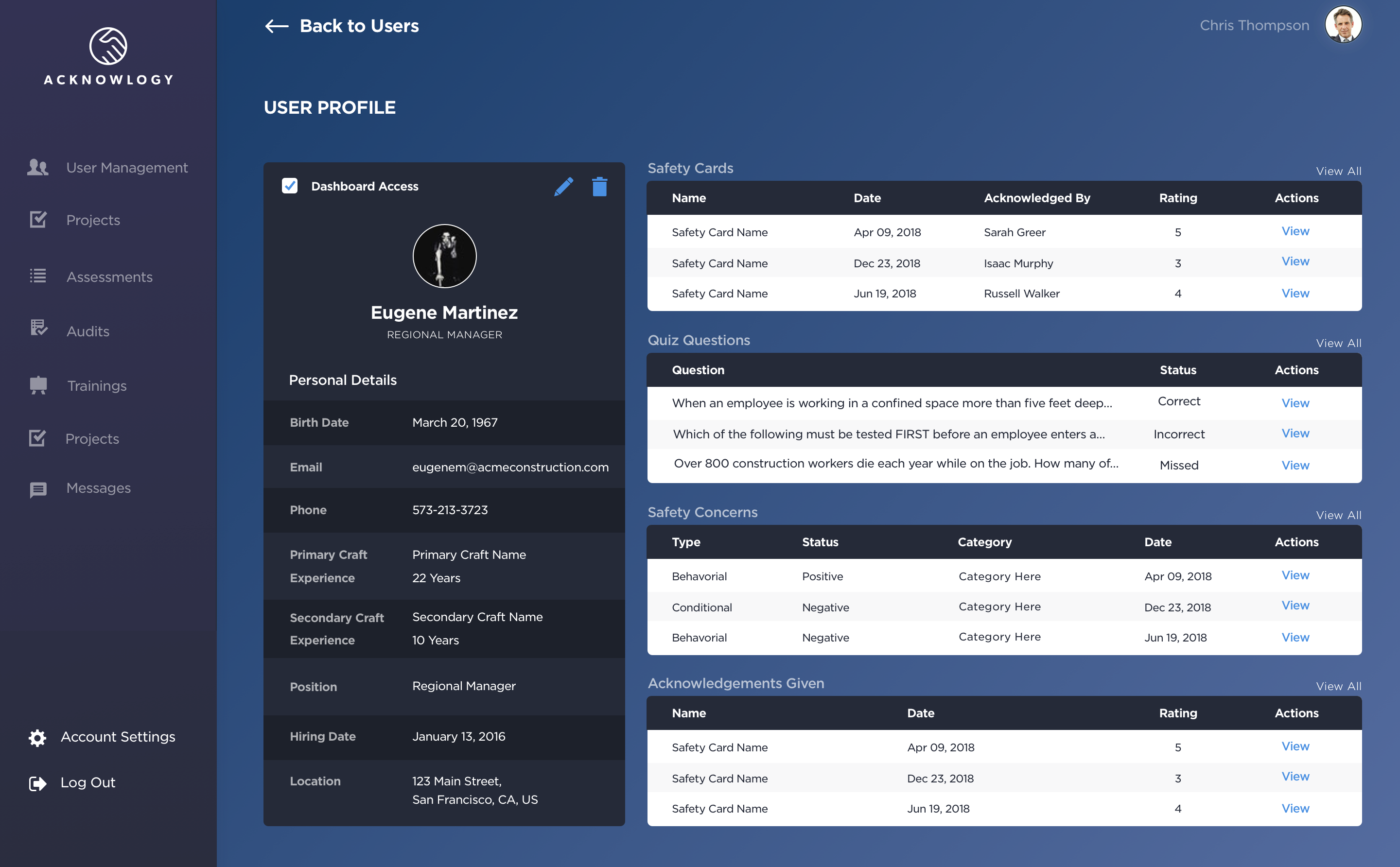
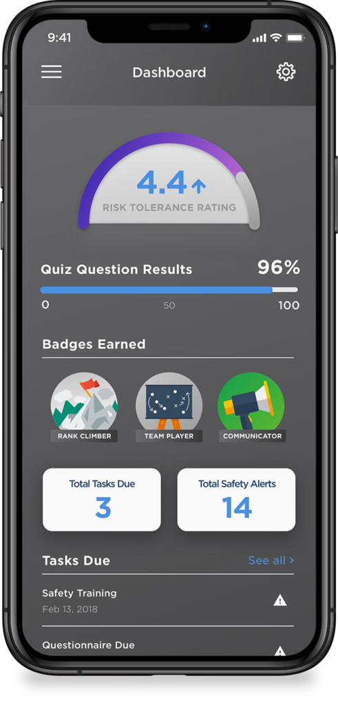
Measuring real-time leading indicators of safety effort and performance data instead of relying on lagging indicators that only measure failures. Demonstrating and creating alignment as all humans in the organization participate and acknowledge another person’s daily safety effort. Acknowlogy is a platform for any company looking to reduce costs and keep their people safe. 

AGENCY + CLIENT

Acknowlogy – ThoughtLab

ROLE

UI/UX Design, Mobile App Design, Creative Direction, Branding

PLATFORM

iOS, Android, Desktop, Tablet, Mobile
finding a better way to stay safe

Helping improve safety and health management systems by measurement and acknowledgment of ​purposeful effort.

the problem

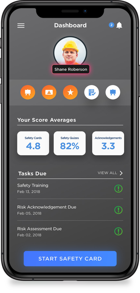
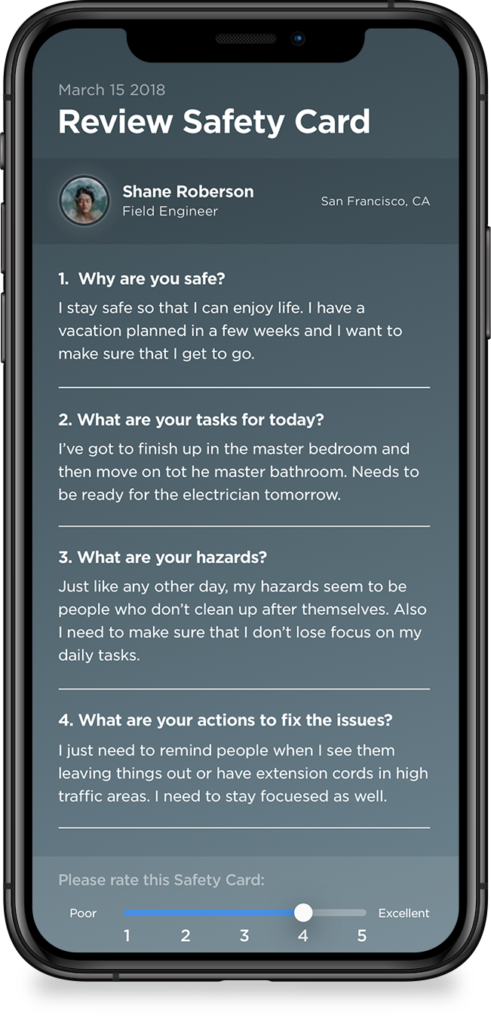
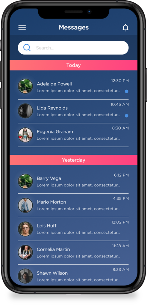
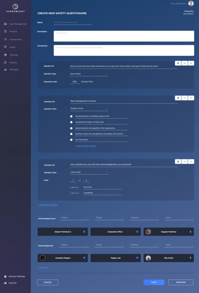
Acknowlogy started as a dream from a client. He had the basic ideas of how it all worked. I was tasked with creating not only his brand, but the entire functionality of the mobile app and corresponding software, as well as the UI and designs for both pieces. As if that wasn’t already a daunting task, there was a relatively tight timeframe and an even tighter budget. 

After countless meetings and back and forth, we were able to pull it off. We ended up creating a product that is currently being used my many different companies, even outside of the initially intended field of construction. 

ACKNOWLOGY

keeping people safe on the job site

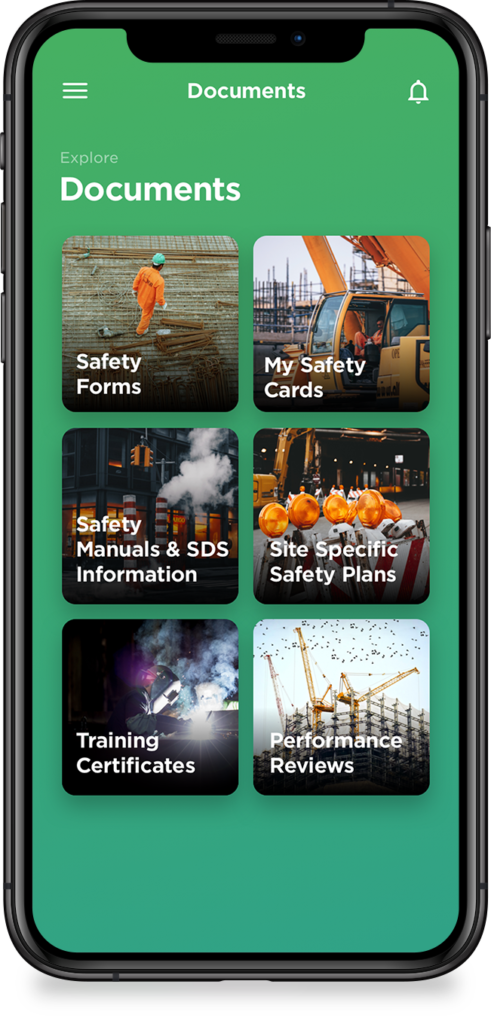
building an app that promotes safety

rapid solutions

As the sole designer on the project, there was a lot of pressure to work fast and efficiently. This resulted in the use of rapid prototyping. I had to prepare my files to be able to make changes on the fly. Usability testing had to be done with anyone I could find.

The usability tests showed that with everything the client was asking for, it just made it too complicated for the user to know which path to take at the start. 

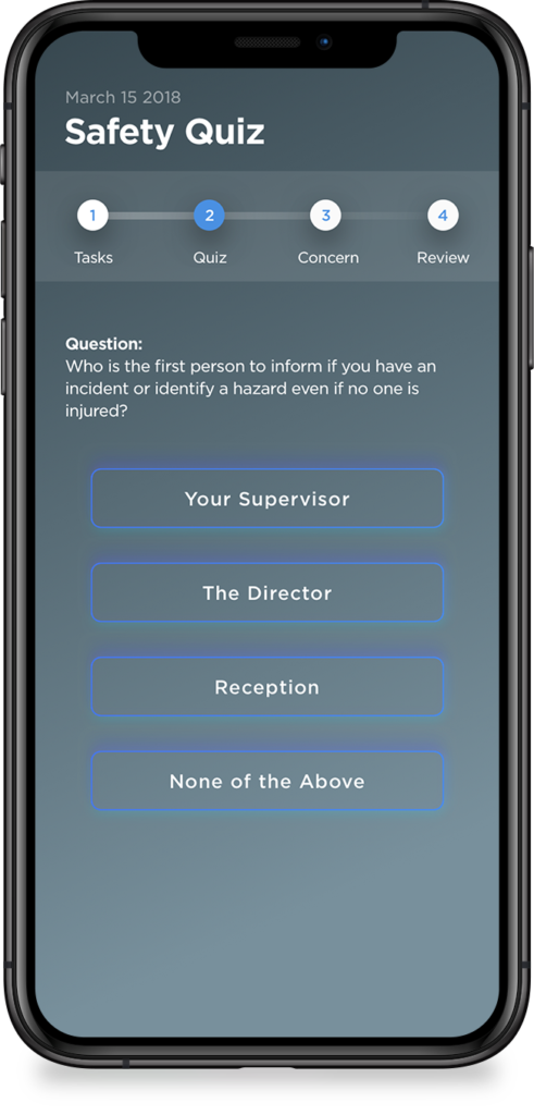
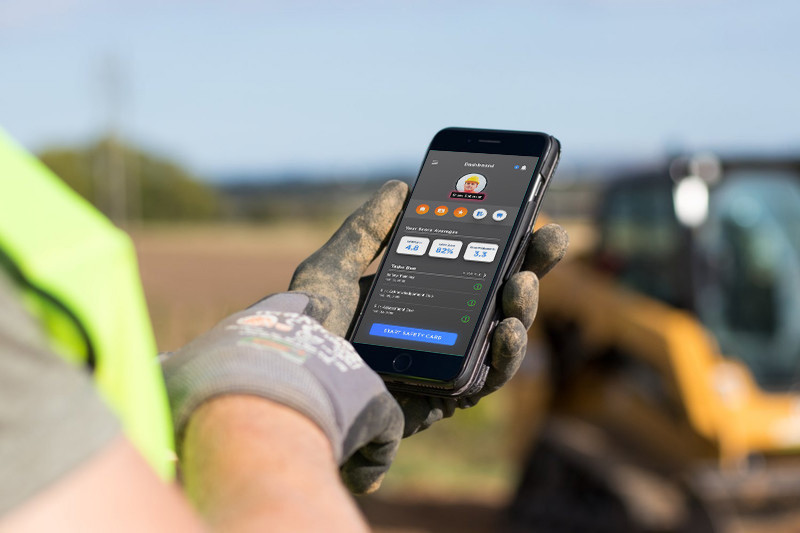
I solved for this by removing anything that was a ‘nice to have’ and making more of a walk-thru type format. The results instantly changed from confusion to simple and clear, daily use app in our construction worker test groups.

ideas into reality

There were many challenges that arose within this project, but the biggest was time and budget. With the client starting his own business, he needed a working prototype to show potential investors and fast. Seemed like everytime he showed it off someone had a new idea for us to explore. It was difficult to keep an MVP in mind with the client as he kept asking for more. After sitting down with him and having a frank talk, he saw that having a rushed product would only result in bugs, frustrated investors and users. Also, I gave him some ‘homework’ that we needed done using his industry knowledge that kept him busy, but also kept him involved directly in the project. 

creating a dream

The best part of this project was making it happen for this client. His passion and drive for his company was a catalyst in pushing this project forward. He has had great success when presenting this system, on both the app and the software piece. 

we also were able to cut the amount of paperwork and time needed to get employees working, while still fulfilling the need to keep the job site safe.

the takeaways

Acknowlogy made me rethink how I approached scope creep with clients. They wanted to move faster than the project without looking at the results. By putting a better roadmap in place and giving the client a better understanding of usability testing, research and overall outcomes, I was able to give us (design and developers) the time needed to get an MVP out and stop moving the goal line.

Brandon Green

801.510.8363

brandon@brandgreen.net