Challenger School

Bring Them to the Front of the Class

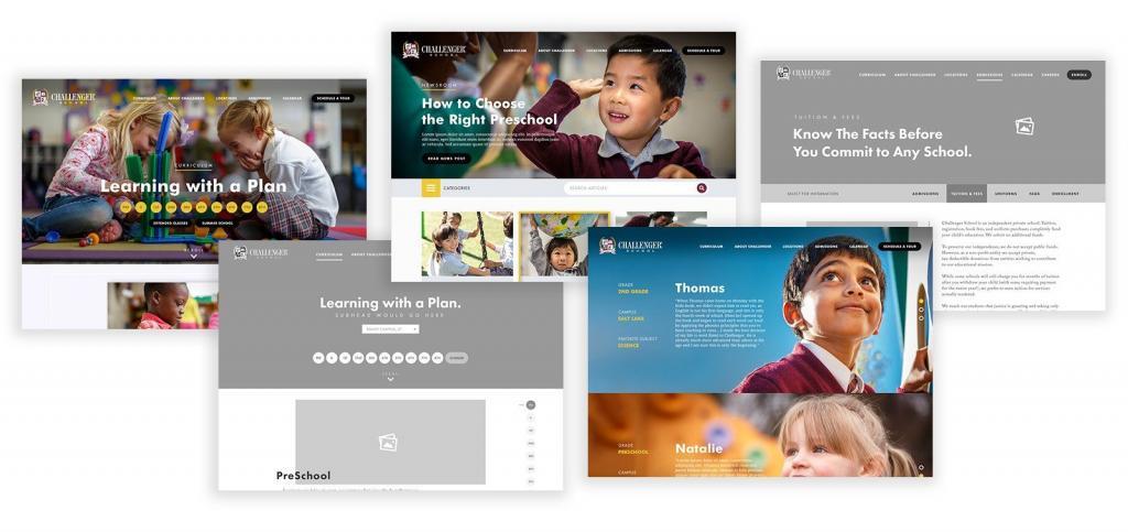
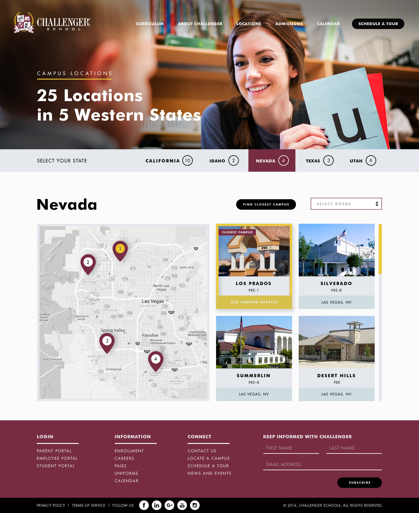
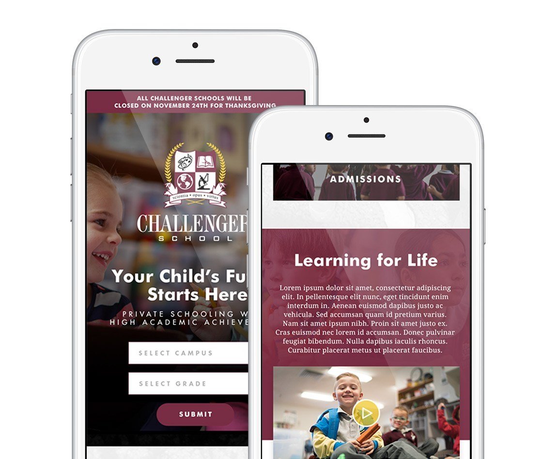
Challenger School had a site that was very basic, and really only gave a snapshot of what they had to offer. They needed not only a new website, but a whole new structure to things like a parent portal, teacher portal, and an app. The challenge was finding a way to make all of these elements feel like they were a part of the same brand. Starting from scratch, I needed to do my research into what they could offer using their existing tools, and then improve from there. Our overall goal for the site was to make it so a parent could find all the information they needed to make an informed decision about enrolling their student.

AGENCY + CLIENT

Challenger School – Red Olive

ROLE

UI/UX Design, Website Design, Creative Direction

PLATFORM

Desktop, Tablet, Mobile

unmatched academic results‎

Challenger School hadn’t updated their site in years. It felt dated and not functional at all for teachers and parents. I was asked to not only update the look and feel, but to add elements that would bring people back to the website over and over.  

needed to bring their grades up

Challenger School is a private school that is located in 5 states and has 26 schools. As they started seeing other private schools update their brand and digital presence, they realized that they were falling more and more behind with each year. 

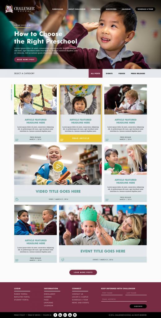
With that in mind they came to Red Olive and I worked with them on their brand, their image and a new website that had all the bells and whistles that a student’s parents could want. 

CHALLENGER

Inspiring Children to Achieve

Starting Early and Starting Right

about the kids

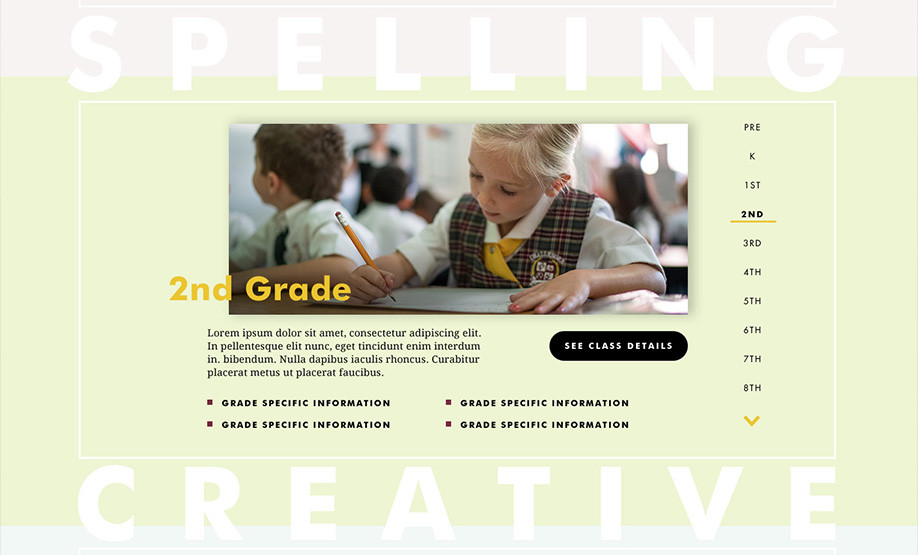
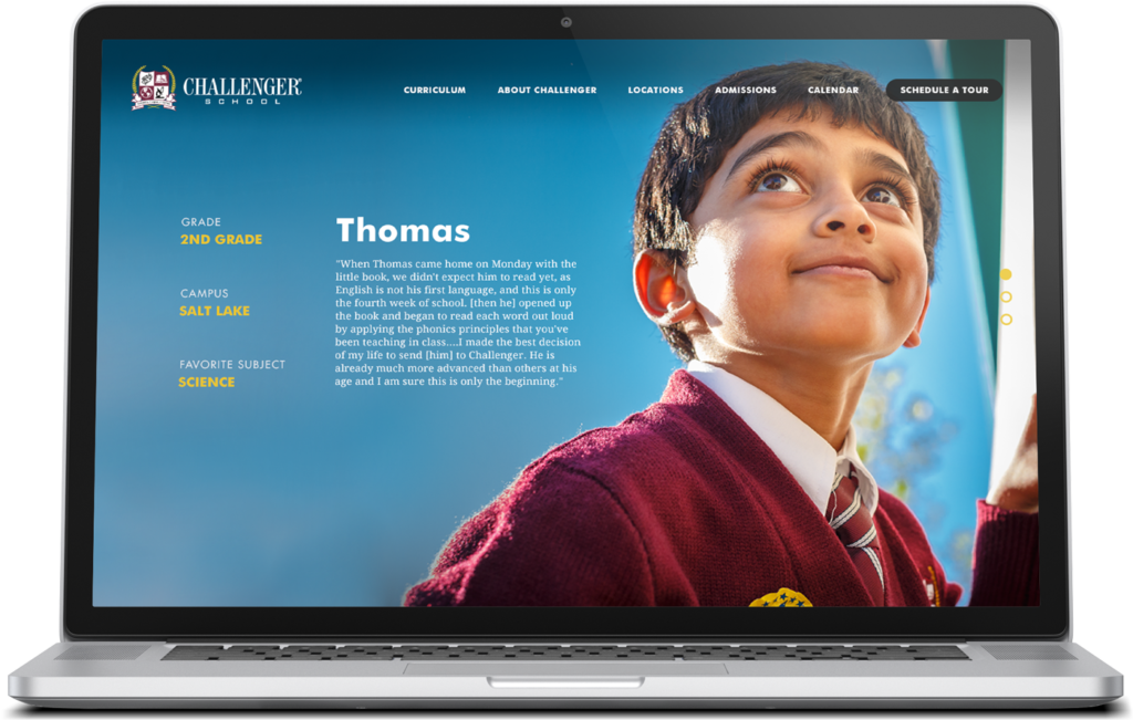
With 25 schools across 5 states, Challenger School has many different demographics. Since the students wear uniforms, we couldn’t just use stock images. All the photos needed to be of actual students, but also show the diversity across all the campuses.

Brandon Green

801.510.8363

brandon@brandgreen.net