UX Design
REDESIGNING ENTERPRISE UX AT SCALE
Redesigning an enterprise platform while it’s live is a bit like replacing airplane engines mid-flight. You can’t stop. You can’t coast. You have to make huge changes without killing the momentum or the trust of the people relying on it every single day.
This was the reality I walked into. The platform in question was the backbone of the business — mission-critical, high-traffic, and relied on by thousands of people worldwide. It wasn’t broken, but it was far from healthy. Years of patchwork updates, inconsistent design patterns, and disconnected teams had left it slow, clunky, and visually chaotic. The problems weren’t just cosmetic. They slowed down work, created user confusion, and piled up costly support tickets.
Role
Lead UX Designer
Duration
10 Months
Contribution
Research, Scalable Design System, Cross-Functional Delivery
Target Audience
Fortune 100 organizations who needed quality auditing management software

MVP platform redesign
Fully working redesign delivered in under 12 months
Design system creation
Cutting design/development time by 30%
Client satisfaction improved
Positive feedback from McDonald’s and Starbucks audit teams
Mobile task time reduced by 40%
Through contextual inputs and smart defaults
PROBLEM
REDESIGNING WITHOUT STOPPING THE MACHINE
The platform had been built in pieces over many years. Each team had added its own features, styles, and workflows with little coordination. As a result, the interface looked like it had been designed by a dozen different companies. Buttons meant different things depending on where you clicked. The navigation changed from one section to the next. Accessibility compliance was inconsistent at best.
The problems were bigger than design. They were about trust. Users didn’t trust the system to be consistent, and the business couldn’t trust the design process to deliver fast, scalable improvements. Product had their own priorities, engineering was juggling multiple releases, and leadership needed assurance that changes wouldn’t break anything critical.
This wasn’t a blank-canvas redesign. It was open-heart surgery on a system that couldn’t afford to stop beating.
Led the UX strategy, created the design system, and drove the redesign across multiple teams under tight deadlines.
APPROACH
STEP ONE: RESIST THE TEMPTATION TO JUMP INTO SCREENS RIGHT AWAY
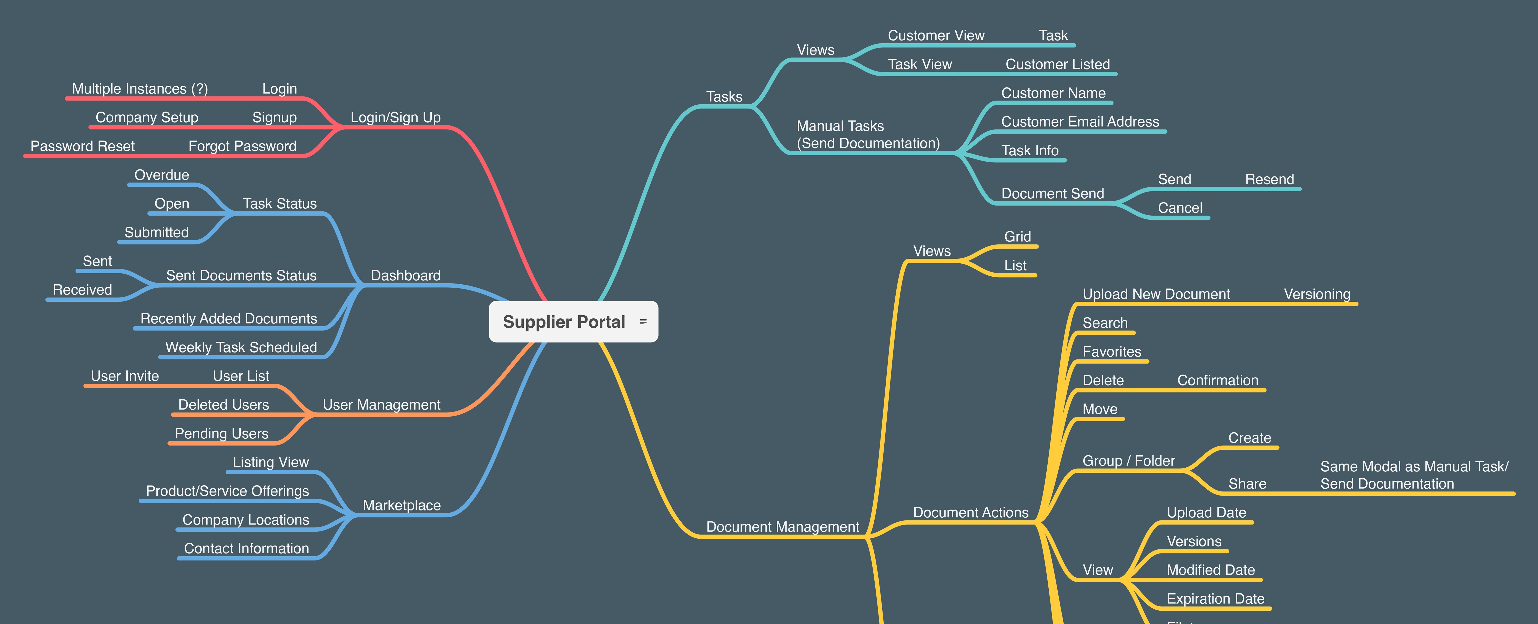
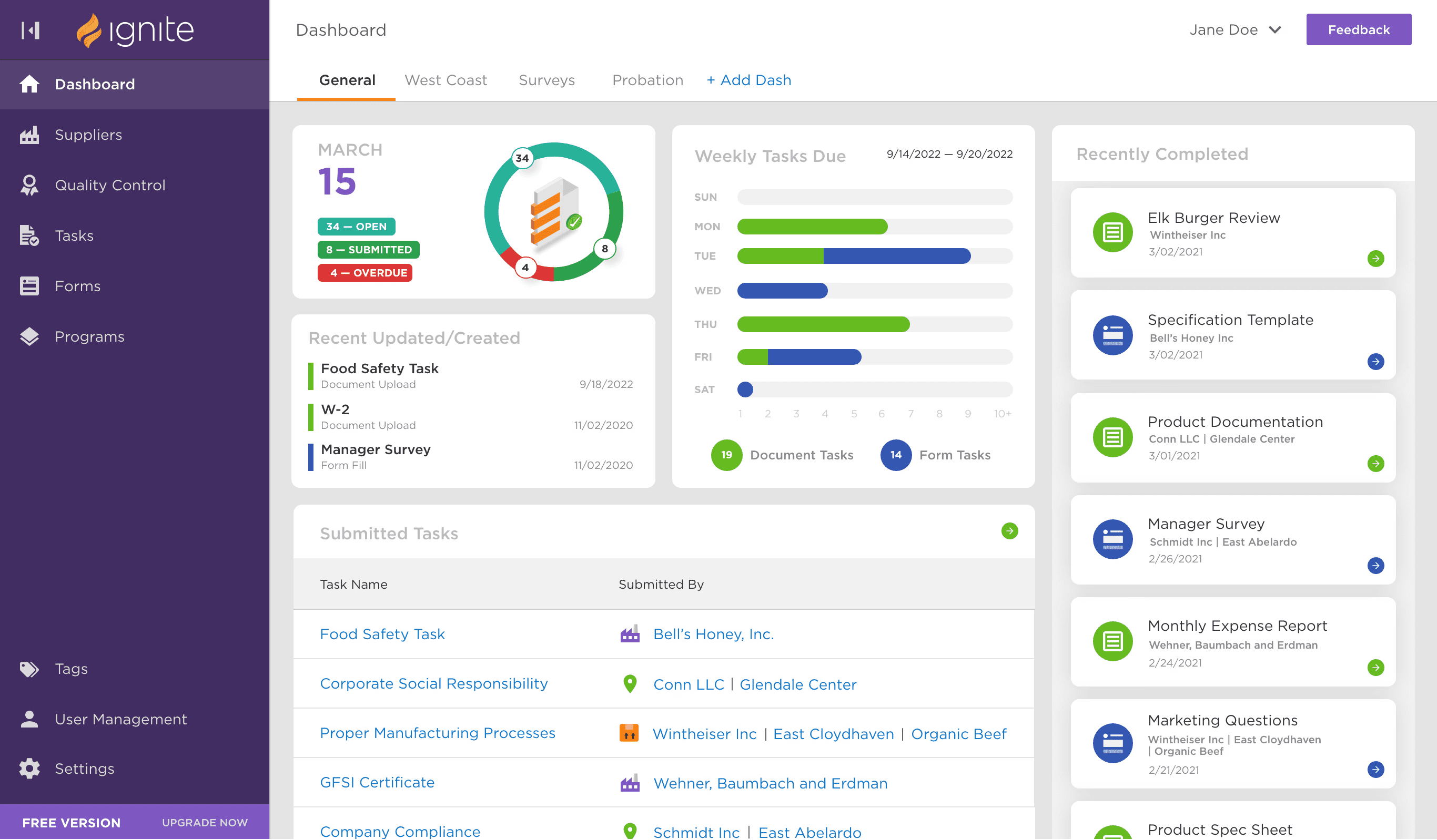
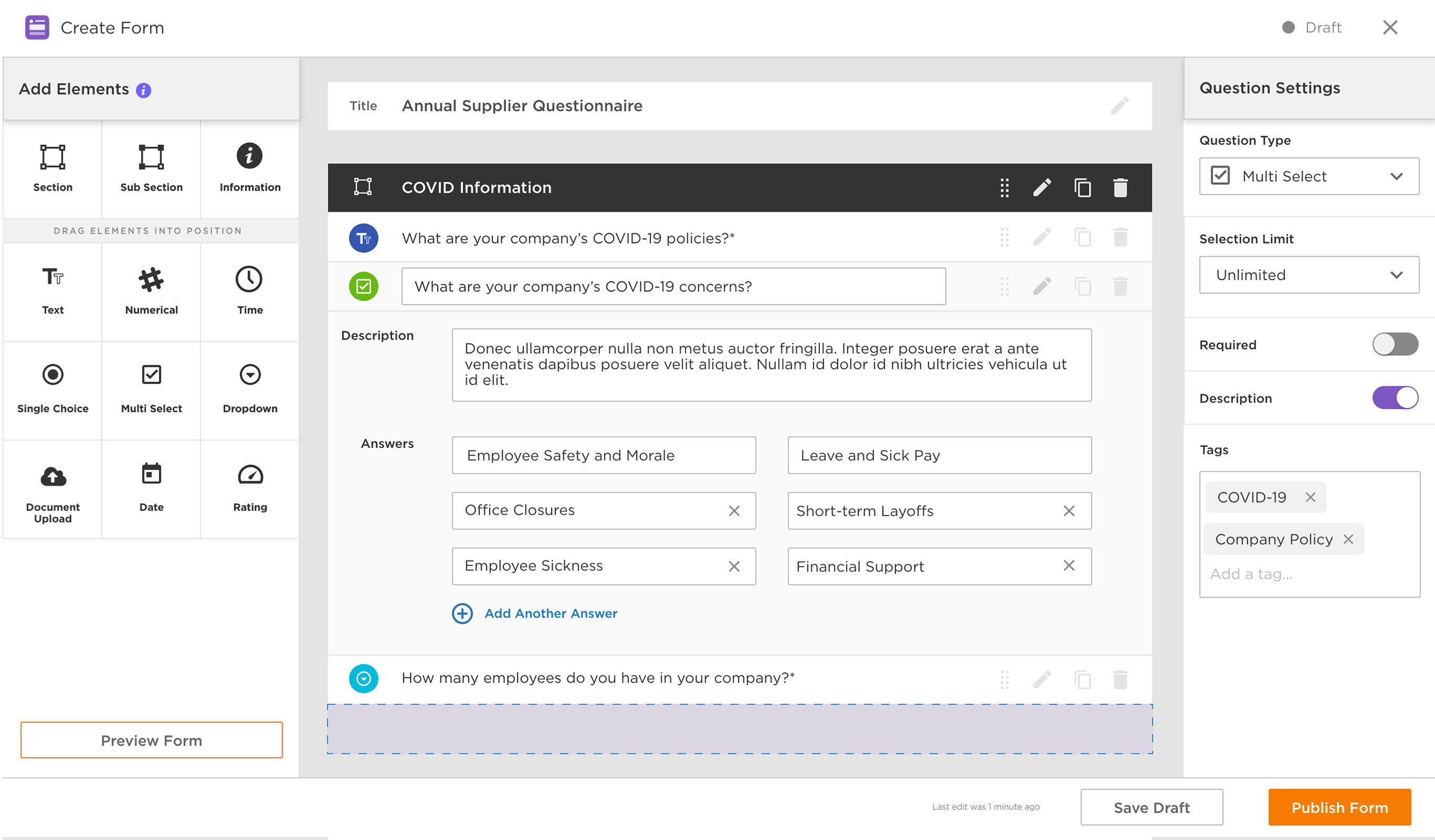
I led the design with creating modular, scalable components that could serve as the building blocks for every piece of the platform. This wasn’t just a library of UI, but a shared language that bridged the gap between design, engineering, and the PM. Every component had clear rules, accessibility baked in, and the flexibility to adapt to different product needs without breaking visual or functional consistency.
Research was integrated into the process from day one, but not in the “run a three-month study” kind of way. We didn’t have that luxury. Instead, we embedded lightweight usability testing into every sprint. We pulled behavioral analytics to spot bottlenecks and paired them with quick user feedback sessions to validate fixes before they went live. Our research pool was global, covering different languages, cultures, and accessibility needs. The focus was always on identifying the fastest, safest way to solve real problems without adding new ones.
01.
Built a Modular, Scalable Design System
Built a Modular, Scalable Design System
Built a Modular, Scalable Design System
Created components and patterns that enabled rapid redesign while improving consistency.
02.
Drove Cross-Functional Alignment
Drove Cross-Functional Alignment
Drove Cross-Functional Alignment
Established clear roles and processes so UX, engineering, and product could move fast without breaking things.
03.
Embedded Research with Global Clients
Embedded Research with Global Clients
Embedded Research with Global Clients
Ran continuous research to validate designs with users worldwide, uncovering issues early.
04.
Shipped in Phases with Continuous Validation
Shipped in Phases with Continuous Validation
Shipped in Phases with Continuous Validation
Rolled out the redesign incrementally, reducing risk and keeping delivery velocity high.
Alignment was the next critical piece. Large enterprise redesigns fail when teams pull in different directions, so we made sure we had weekly (sometimes daily) cross-functional working sessions. Design, engineering, product manager, and business stakeholders all sat at the same table, seeing the same work at the same time. These weren’t just “status updates,” they were working meetings where we made real-time decisions, cleared roadblocks, and kept the release pipeline moving.
Finally, we rolled out changes in small, controlled phases. Instead of flipping a switch on a massive redesign, we introduced updates one workflow at a time. Users adjusted quickly, confidence grew, and we avoided the “everything’s different and I can’t find anything” backlash that big-bang launches so often create.
OUTCOMES
IMPACT THAT COULD BE MEASURED
This wasn’t a project that ended with a single launch date. It was a rolling transformation that improved the platform in measurable, visible ways over time.
Key workflows that had been slow and error-prone became faster and smoother. Support tickets tied to confusing UI and a bloated nav dropped steadily as each update went live. Development cycles shortened because engineers could pull from a ready-to-use design system instead of reinventing the wheel for every release. Accessibility compliance improved dramatically, opening the door for a broader range of users and reducing legal risk.
More importantly, teams started trusting the design process again. The system wasn’t just better for users, it was better for the people building it.
Delivered a faster, more consistent user experience while meeting every deadline and maintaining full operational continuity.

WHY IT MATTERS
LARGE-SCALE CHANGE CAN HAPPEN WITHOUT CHAOS
In a perfect world, redesigns happen in calm, well-planned phases with plenty of time and budget. In reality, they happen while the plane is still in the air. This project was about managing that reality, while also keeping the business running AND making significant, lasting improvements.
It proved that you don’t need a clean slate to make an enterprise system usable, scalable, and accessible. You just need the right foundation, the right process, and the discipline to make changes that stick. Also didn't hurt have an incredible team of engineers and a PM who kept it all together.
And while it didn’t make for a flashy “before-and-after” moment, it delivered something far more valuable: a platform that people could work with, trust, and grow.
More Projects


UX Design
REDESIGNING ENTERPRISE UX AT SCALE
Redesigning an enterprise platform while it’s live is a bit like replacing airplane engines mid-flight. You can’t stop. You can’t coast. You have to make huge changes without killing the momentum or the trust of the people relying on it every single day.
This was the reality I walked into. The platform in question was the backbone of the business — mission-critical, high-traffic, and relied on by thousands of people worldwide. It wasn’t broken, but it was far from healthy. Years of patchwork updates, inconsistent design patterns, and disconnected teams had left it slow, clunky, and visually chaotic. The problems weren’t just cosmetic. They slowed down work, created user confusion, and piled up costly support tickets.
Role
Lead UX Designer
Duration
10 Months
Contribution
Research, Scalable Design System, Cross-Functional Delivery
Target Audience
Fortune 100 organizations who needed quality auditing management software
MVP platform redesign
Fully working redesign delivered in under 12 months
Design system creation
Cutting design/development time by 30%
Client satisfaction improved
Positive feedback from McDonald’s and Starbucks audit teams
Mobile task time reduced by 40%
Through contextual inputs and smart defaults
PROBLEM
REDESIGNING WITHOUT STOPPING THE MACHINE
The platform had been built in pieces over many years. Each team had added its own features, styles, and workflows with little coordination. As a result, the interface looked like it had been designed by a dozen different companies. Buttons meant different things depending on where you clicked. The navigation changed from one section to the next. Accessibility compliance was inconsistent at best.
The problems were bigger than design. They were about trust. Users didn’t trust the system to be consistent, and the business couldn’t trust the design process to deliver fast, scalable improvements. Product had their own priorities, engineering was juggling multiple releases, and leadership needed assurance that changes wouldn’t break anything critical.
This wasn’t a blank-canvas redesign. It was open-heart surgery on a system that couldn’t afford to stop beating.
Led the UX strategy, created the design system, and drove the redesign across multiple teams under tight deadlines.
APPROACH
STEP ONE: RESIST THE TEMPTATION TO JUMP INTO SCREENS RIGHT AWAY
I led the design with creating modular, scalable components that could serve as the building blocks for every piece of the platform. This wasn’t just a library of UI, but a shared language that bridged the gap between design, engineering, and the PM. Every component had clear rules, accessibility baked in, and the flexibility to adapt to different product needs without breaking visual or functional consistency.
Research was integrated into the process from day one, but not in the “run a three-month study” kind of way. We didn’t have that luxury. Instead, we embedded lightweight usability testing into every sprint. We pulled behavioral analytics to spot bottlenecks and paired them with quick user feedback sessions to validate fixes before they went live. Our research pool was global, covering different languages, cultures, and accessibility needs. The focus was always on identifying the fastest, safest way to solve real problems without adding new ones.
01.
Built a Modular, Scalable Design System
Built a Modular, Scalable Design System
Built a Modular, Scalable Design System
Created components and patterns that enabled rapid redesign while improving consistency.
02.
Drove Cross-Functional Alignment
Drove Cross-Functional Alignment
Drove Cross-Functional Alignment
Established clear roles and processes so UX, engineering, and product could move fast without breaking things.
03.
Embedded Research with Global Clients
Embedded Research with Global Clients
Embedded Research with Global Clients
Ran continuous research to validate designs with users worldwide, uncovering issues early.
04.
Shipped in Phases with Continuous Validation
Shipped in Phases with Continuous Validation
Shipped in Phases with Continuous Validation
Rolled out the redesign incrementally, reducing risk and keeping delivery velocity high.
Alignment was the next critical piece. Large enterprise redesigns fail when teams pull in different directions, so we made sure we had weekly (sometimes daily) cross-functional working sessions. Design, engineering, product manager, and business stakeholders all sat at the same table, seeing the same work at the same time. These weren’t just “status updates,” they were working meetings where we made real-time decisions, cleared roadblocks, and kept the release pipeline moving.
Finally, we rolled out changes in small, controlled phases. Instead of flipping a switch on a massive redesign, we introduced updates one workflow at a time. Users adjusted quickly, confidence grew, and we avoided the “everything’s different and I can’t find anything” backlash that big-bang launches so often create.
OUTCOMES
IMPACT THAT COULD BE MEASURED
This wasn’t a project that ended with a single launch date. It was a rolling transformation that improved the platform in measurable, visible ways over time.
Key workflows that had been slow and error-prone became faster and smoother. Support tickets tied to confusing UI and a bloated nav dropped steadily as each update went live. Development cycles shortened because engineers could pull from a ready-to-use design system instead of reinventing the wheel for every release. Accessibility compliance improved dramatically, opening the door for a broader range of users and reducing legal risk.
More importantly, teams started trusting the design process again. The system wasn’t just better for users, it was better for the people building it.
Delivered a faster, more consistent user experience while meeting every deadline and maintaining full operational continuity.
WHY IT MATTERS
LARGE-SCALE CHANGE CAN HAPPEN WITHOUT CHAOS
In a perfect world, redesigns happen in calm, well-planned phases with plenty of time and budget. In reality, they happen while the plane is still in the air. This project was about managing that reality, while also keeping the business running AND making significant, lasting improvements.
It proved that you don’t need a clean slate to make an enterprise system usable, scalable, and accessible. You just need the right foundation, the right process, and the discipline to make changes that stick. Also didn't hurt have an incredible team of engineers and a PM who kept it all together.
And while it didn’t make for a flashy “before-and-after” moment, it delivered something far more valuable: a platform that people could work with, trust, and grow.
More Projects
UX Design
REDESIGNING ENTERPRISE UX AT SCALE
Redesigning an enterprise platform while it’s live is a bit like replacing airplane engines mid-flight. You can’t stop. You can’t coast. You have to make huge changes without killing the momentum or the trust of the people relying on it every single day.
This was the reality I walked into. The platform in question was the backbone of the business — mission-critical, high-traffic, and relied on by thousands of people worldwide. It wasn’t broken, but it was far from healthy. Years of patchwork updates, inconsistent design patterns, and disconnected teams had left it slow, clunky, and visually chaotic. The problems weren’t just cosmetic. They slowed down work, created user confusion, and piled up costly support tickets.
Role
Lead UX Designer
Duration
10 Months
Contribution
Research, Scalable Design System, Cross-Functional Delivery
Target Audience
Fortune 100 organizations who needed quality auditing management software
MVP platform redesign
Fully working redesign delivered in under 12 months
Design system creation
Cutting design/development time by 30%
Client satisfaction improved
Positive feedback from McDonald’s and Starbucks audit teams
Mobile task time reduced by 40%
Through contextual inputs and smart defaults
PROBLEM
REDESIGNING WITHOUT STOPPING THE MACHINE
The platform had been built in pieces over many years. Each team had added its own features, styles, and workflows with little coordination. As a result, the interface looked like it had been designed by a dozen different companies. Buttons meant different things depending on where you clicked. The navigation changed from one section to the next. Accessibility compliance was inconsistent at best.
The problems were bigger than design. They were about trust. Users didn’t trust the system to be consistent, and the business couldn’t trust the design process to deliver fast, scalable improvements. Product had their own priorities, engineering was juggling multiple releases, and leadership needed assurance that changes wouldn’t break anything critical.
This wasn’t a blank-canvas redesign. It was open-heart surgery on a system that couldn’t afford to stop beating.
Led the UX strategy, created the design system, and drove the redesign across multiple teams under tight deadlines.
APPROACH
STEP ONE: RESIST THE TEMPTATION TO JUMP INTO SCREENS RIGHT AWAY
I led the design with creating modular, scalable components that could serve as the building blocks for every piece of the platform. This wasn’t just a library of UI, but a shared language that bridged the gap between design, engineering, and the PM. Every component had clear rules, accessibility baked in, and the flexibility to adapt to different product needs without breaking visual or functional consistency.
Research was integrated into the process from day one, but not in the “run a three-month study” kind of way. We didn’t have that luxury. Instead, we embedded lightweight usability testing into every sprint. We pulled behavioral analytics to spot bottlenecks and paired them with quick user feedback sessions to validate fixes before they went live. Our research pool was global, covering different languages, cultures, and accessibility needs. The focus was always on identifying the fastest, safest way to solve real problems without adding new ones.
01.
Built a Modular, Scalable Design System
Built a Modular, Scalable Design System
Built a Modular, Scalable Design System
Created components and patterns that enabled rapid redesign while improving consistency.
02.
Drove Cross-Functional Alignment
Drove Cross-Functional Alignment
Drove Cross-Functional Alignment
Established clear roles and processes so UX, engineering, and product could move fast without breaking things.
03.
Embedded Research with Global Clients
Embedded Research with Global Clients
Embedded Research with Global Clients
Ran continuous research to validate designs with users worldwide, uncovering issues early.
04.
Shipped in Phases with Continuous Validation
Shipped in Phases with Continuous Validation
Shipped in Phases with Continuous Validation
Rolled out the redesign incrementally, reducing risk and keeping delivery velocity high.
Alignment was the next critical piece. Large enterprise redesigns fail when teams pull in different directions, so we made sure we had weekly (sometimes daily) cross-functional working sessions. Design, engineering, product manager, and business stakeholders all sat at the same table, seeing the same work at the same time. These weren’t just “status updates,” they were working meetings where we made real-time decisions, cleared roadblocks, and kept the release pipeline moving.
Finally, we rolled out changes in small, controlled phases. Instead of flipping a switch on a massive redesign, we introduced updates one workflow at a time. Users adjusted quickly, confidence grew, and we avoided the “everything’s different and I can’t find anything” backlash that big-bang launches so often create.
OUTCOMES
IMPACT THAT COULD BE MEASURED
This wasn’t a project that ended with a single launch date. It was a rolling transformation that improved the platform in measurable, visible ways over time.
Key workflows that had been slow and error-prone became faster and smoother. Support tickets tied to confusing UI and a bloated nav dropped steadily as each update went live. Development cycles shortened because engineers could pull from a ready-to-use design system instead of reinventing the wheel for every release. Accessibility compliance improved dramatically, opening the door for a broader range of users and reducing legal risk.
More importantly, teams started trusting the design process again. The system wasn’t just better for users, it was better for the people building it.
Delivered a faster, more consistent user experience while meeting every deadline and maintaining full operational continuity.
WHY IT MATTERS
LARGE-SCALE CHANGE CAN HAPPEN WITHOUT CHAOS
In a perfect world, redesigns happen in calm, well-planned phases with plenty of time and budget. In reality, they happen while the plane is still in the air. This project was about managing that reality, while also keeping the business running AND making significant, lasting improvements.
It proved that you don’t need a clean slate to make an enterprise system usable, scalable, and accessible. You just need the right foundation, the right process, and the discipline to make changes that stick. Also didn't hurt have an incredible team of engineers and a PM who kept it all together.
And while it didn’t make for a flashy “before-and-after” moment, it delivered something far more valuable: a platform that people could work with, trust, and grow.